
Effective infographics reduce barriers to understanding by making information and data more accessible. They condense complexity into something manageable and help us work around our cognitive limitations. It’s no wonder we’re drawn to infographics. By understanding how graphics are perceived and processed, we can improve the instructional design of infographics.
In his book, The Functional Art, Alberto Cairo writes, “The first and main goal of any graphic and visualization is to be a tool for your eyes and brain to perceive what lies beyond their natural reach.” Listen to my conversation with Alberto Cairo in an early podcast: How to Design Real Information Graphics.
Accessibility Note
Screen readers cannot reliably interpret information graphics, so any essential content in a visual must be provided in a text-based alternative, including tables for underlying data. You can learn more from the excellent resources and accessibility tools at WebAIM.
Using Generative AI
AI tools can support early stages of the information graphics workflow by helping designers surface plausible structures in text-heavy material, such as sequences, comparisons, or categories. This can make the underlying organization of the content more clear before you begin designing.
However, AI does not determine how information should be chunked for learning. Decisions about what to represent, what to simplify, and what to emphasize still depend on cognitive principles such as visual hierarchy, chunking, and processing fluency. In addition, many AI tools generate graphics in a non-editable format. Tools that preserve structure and allow iteration, such as Napkin, Whimsical AI, and some whiteboarding platforms are far more useful.
Quantitative versus Qualitative Infographics
Infographics can represent both quantitative and qualitative content. Quantitative infographics convey numbers and data—anything that can be measured—such as graphs, data visualizations, and statistical or thematic maps. These infographics help learners comprehend data by transforming abstract numbers into more concrete representations.
Qualitative infographics represent content that can’t be measured. They use charts, diagrams, and illustrations to depict objects, relationships, and ideas. These visualizations support learning by clarifying concepts, showing structure, and revealing how ideas are organized. Hybrid infographics combine both quantitative and qualitative elements.
Designing and Interpreting Infographics
When designing quantitative infographics, you translate data values into visual features. You encode data values into points, lines, shapes, colors, and similar attributes. For example, in a line graph, each data point is represented by its position on a coordinate scale, while the color of the line may represent a data category.
When designing qualitative infographics, particularly charts and diagrams, you encode concepts into spatial features. For example, grouping elements close together can indicate a relationship. Placing the president of a company at the top of an organizational chart conveys importance.
Encoding is just one aspect to consider when designing infographics for learning. If you’re looking for ways to get started with infographic design or to improve infographics for learning, the following 21 guidelines can help.
Make a Plan
1. Analyze the need. Analyze the data and information at hand. Will a visualization improve the audience’s understanding? Are you telling a story or persuading with statistics? If you determine there is a need for an infographic, move forward with the learner in mind. If not, stop before you back yourself into a corner.
2. Identify the objective of the visualization. Determine what you want the audience to do with the infographic. What should they know? What action should they take? Think as you would when applying an instructional design process to any learning experience.
3. Plan for accessibility and universal design. Before selecting formats or visual styles, consider how the information will be accessed by a wide range of learners. Plan for sufficient contrast, alternatives to color-only meaning, readable text, and text-based equivalents for screen readers. Accessibility decisions are far more effective when made early rather than retrofitted later.
4. Determine the graphic literacy of the audience members. If possible, identify whether your audience can extract meaning from the format you choose. People at all education levels may struggle to interpret graphs. Unless you are designing for scientists, researchers, or statisticians, choose commonly used visualization formats found in popular media. For example, research shows that most people find vertical bar charts (column graphs) with scales easier to understand than many other graph types.
5. Choose the right visualization for your data and content. Infographic formats are designed for specific types of information. A flowchart effectively shows a process. A line graph is useful for trends over time. Bar graphs are effective for representing and comparing quantities. Many online resources can help you select an appropriate chart type.
6. Create a focus through contrast. Once you know your purpose and how learners should use the information, identify the focal point early in the design process. Emphasize it through contrast, such as size, weight, position, or visual cues, to establish a clear visual hierarchy. This is how you establish a visual hierarchy.
Design for Accessibility and Readability
7. Design for universal access. Do not rely on color alone to convey meaning. Pair color with a secondary cue so information remains understandable without color perception. Labels are especially effective.
Avoid color combinations that are problematic for color-blind users (red/green or blue/yellow). Use strong contrast consistently to support readers with visual impairments. In general, dark text on a light background provides the best readability. Light backgrounds reflect more light overall, which supports visual acuity and letter recognition for most readers. Dark mode may be comfortable in low light situations. See Using Contrast to Improve Visual Accessibility.
8. Choose a clean, legible font. Titles, labels, and explanations are often essential to understanding an infographic. Choose fonts with clearly distinguishable letterforms that are easy to read. As a general rule, paragraphs of text are easier to read when left-justified. See accessibility guidelines for more on font selection and size.
Organize the Layout
9. Align elements with each other. Using a grid helps create a clean, professional layout. Graphics and text can be aligned left, right, or centered. Choose a consistent alignment style and align elements deliberately.
10. Use grouping to show relationships. When you group elements together, readers assume they are related. Grouping can be created through proximity, similarity in size, shape, or color, or by drawing a boundary around elements. The reverse is also true: avoid grouping elements that are not related. See The Power of Visual Grouping for more on this subject.
Make the Meaning Clear
11. Place elements in a logical order. Organizing content means you’re using a logical structure. Arrange elements so they will enhance the meaning of the infographic. For example, if a diagram has numbered parts, place the numbers in an order that is natural to how the audience reads (top to bottom and left to right in Western cultures). If you are working with a bar graph, arrange the data from smallest to largest or the reverse, if it enhances meaning.
12. Make the numbers easy to understand. You can improve most infographics by rounding the numbers and removing the decimal places. Don’t ask the audience to do any math or conversions. Do it for them.
13. Rely on established visual conventions. Many chart types, icons, and color meanings are familiar to visually literate audiences in specific cultures. Using conventional elements, such as common chart types, widely recognized icons, and expected color meanings, reduces cognitive effort because readers don’t have to stop and interpret the design.
14. Make comparisons easy. If you want users to compare data in a graph, use the same color for each category of data. If the comparison is between two different categories of data, then use a second color for the second category. Single bar charts with different colors for every bar are confusing.
Optimize for Visual Efficiency
Visual efficiency means reducing unnecessary effort so learners can grasp the structure and process the meaning quickly.
15. Only include necessary content. Determine what content belongs in the graphic. Remove information that does not directly support the instructional goal, even if it is interesting or well-designed. Reducing content at the source prevents overload before visual design begins.
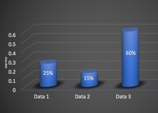
16. Stick with two-dimensional infographics.
Avoid three-dimensional graphs unless the third dimension represents a meaningful data value. Decorative 3D effects, such as those added automatically by tools like Excel, can distort perception and lead to inaccurate interpretations. Perspective can make bars or shapes appear larger or smaller than they are.
17. Select colors that can be easily perceived. Choose colors that can be distinguished from one another at a glance. Ensure sufficient separation between hues so differences are immediately visible.

18. Increase the signal and reduce the noise.
All communication has a signal-to-noise ratio. The signal is your message; the noise is unnecessary clutter. For signals, use visual cues such as arrows, highlights, and alignment to emphasize important information. Downplay elements that compete for attention, such as decorative images, oversized logos, or secondary text.
19. Keep the background in the background.
Design the background so it supports the content without competing for attention. Solid or subdued backgrounds work best. In graphs, use light grid lines and thin strokes so they remain functional but visually recessive.
Represent Data Accurately
20. Use a scale that starts with zero. Readers may misinterpret data when it isn’t represented accurately. To avoid distortion, use graph scales that start at zero and represent differences precisely.
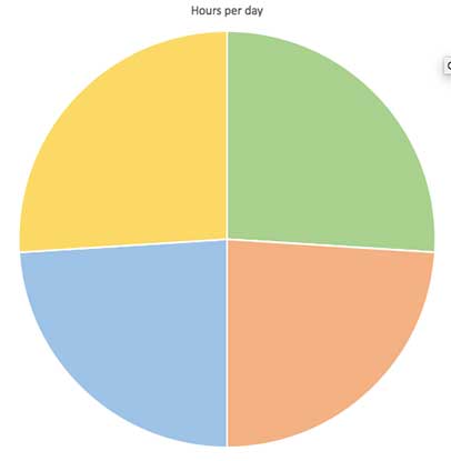
21. Avoid pie charts when accuracy matters.
Pie charts are often misused. They are designed to show parts of a whole, but people are generally poor at estimating areas and angles. This makes it difficult to compare slice sizes reliably. For example, can you order the wedges in the graphic below from smallest to largest?
Conclusion
Visual representations are a proven way to transform data and abstract ideas into more concrete forms. When poorly designed, however, they can also mislead or confuse viewers. Taking time to analyze, reflect, and plan will naturally improve your infographic design skills. This is, in essence, the instructional design of infographics.
References:
- Cairo, A. The Functional Art: An Introduction to Information Graphics and Visualization. New Riders, 2012.
- Friel, Susan N., et al. “Making Sense of Graphs: Critical Factors Influencing Comprehension and Instructional Implications.” Journal for Research in Mathematics Education, vol. 32, no. 2, 2001, pp. 124–158.
- J. Izard, A. Hartzler, D.I. Avery, C. Shih, B.L. Dalkin, J.L. Gore, User-centered design of quality of life reports for clinical care of patients with prostate cancer, Surgery 155 (2014) 789–796.
- J. Izard, A. Hartzler, D.I. Avery, C. Shih, B.L. Dalkin, J.L. Gore, Relevance of graph literacy in the development of patient-centered communication tools. Patient Education and Counseling, 99(3), March 2016, 448-454.
- Kosslyn, S. Elements of Graph Design. W.H. Friedman and Company, 1993.
Get the latest articles, resources and freebies once a month plus the Ultimate Visual Design Toolkit.
[Disclaimer: The content in this RSS feed is automatically fetched from external sources. All trademarks, images, and opinions belong to their respective owners. We are not responsible for the accuracy or reliability of third-party content.]
Source link