
One of the biggest design challenges in learning experiences and presentations is visualizing abstract concepts and data. Concrete subjects often come with obvious imagery: a piece of equipment, a location, a person, or an object. But how do you visualize risk, motivation, economic change, a scientific process, or relationships between ideas?
Diagrams, graphs, and charts can make abstract information more concrete and easier to understand. The challenge is choosing a visual form that clearly represents the underlying information. Here are guidelines for turning abstractions into clear visuals.
For a related article on this topic, see Using Graphics to Improve Learning.
Are you explaining a system or entity?
If your content describes a system’s components and how they relate to one another, use a schematic diagram to provide an overview. Seeing the big picture can help learners understand how the parts fit together before they study them in more detail. Include the key components and use lines or arrows to show relationships, connections, or dependencies.

The Order Fulfillment System diagram shows nine interconnected components: Customer, Order Management System, Payment Processing, Inventory Management, Warehouse Operations, Shipping and Transportation, Delivery, Suppliers, and Returns Management.
Blue single-line arrows represent information flow. Green double-line arrows represent the movement of goods. The customer places an order through the Order Management System, which coordinates payment, inventory, and warehouse operations. The warehouse prepares the order, which moves through shipping and delivery to the customer. Suppliers replenish warehouse inventory. Returns move from the customer through Returns Management and may be sent back to suppliers, while return information flows back into the fulfillment system.
The diagram emphasizes that order fulfillment is an interconnected system rather than a single linear process.
Does the system or entity have a clear hierarchy?
If the information has superordinate and subordinate components, use a hierarchical visualization. These take different forms, but they will always show relative rank, priority, or level. Hierarchies can represent relationships or authority (example: organization charts), importance or effectiveness (as shown below), or classification (example: taxonomy charts from kingdom to species). Position matters: viewers generally interpret elements at the top as having greater precedence than those below.
The Hierarchy of Controls shown below ranks methods for reducing workplace hazards from most to least effective.

The Hierarchy of Controls ranks five approaches to reducing workplace hazards from most to least effective. From most to least effective, the levels are:
- Eliminate the hazard: Physically remove the hazard.
- Substitute something safer: Replace the hazard with a less risky alternative.
- Engineering controls: Isolate people from the hazard through design changes or protective equipment.
- Administrative controls: Change how people work through policies, procedures, training, or signage.
- Personal protective equipment (PPE): Protect workers with equipment such as helmets, goggles, or other protective gear.
The vertical arrangement communicates the hierarchy: controls at the top are generally more effective because they address the hazard itself, while controls toward the bottom rely more on changing worker behavior or protecting the individual.
Does the system or concept have a layered structure?
Use a layer diagram to show a high-level view of a system made up of structures, tiers, or components that are conceptually stacked or overlaid. A geographic information system, or GIS, combines different types of location-based data so they can be viewed and analyzed together. This example from the U.S. Government Accountability Office shows how different types of geographic data can be represented as separate layers and then combined into one integrated view. The layered diagram makes the structure immediately visible and easier to understand.
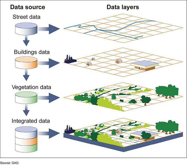
The Geographic Information System combines data from three sources, each represented as a separate layer. The final layer integrates the information into one visual.
1. Street data
2. Building data
3. Vegetation data
4. Integrated data
Are you explaining a process or procedure?
To visually explain a process or procedure, show each step in the correct order. Use arrows, numbers, or both to show the sequence and guide viewers through the process. In the example below, the steps for using a fire extinguisher are numbered and illustrated with icons. The icons make the procedure more concrete and easier to follow than text alone.

Are you presenting statistics?
When you need to present a simple statistic, look for a visual approach that makes the number more concrete. In the example below, the percentages are represented by coloring the appropriate number of circles in a 100-unit grid. This type of graphic is easy to create in PowerPoint or a graphics program, and it works especially well for percentages and proportions. For data that involves comparing several values, a graph may be a better choice, as shown in the next section.

Are you making comparisons?
If you’re comparing quantitative information across categories, a bar chart is often a good choice. Keep related bars close together so viewers perceive them as a group. Using the same color for bars in the same data series encourages comparison rather than emphasizing individual values. Bar charts are generally easy to interpret because they rely on position and length, two visual encodings people judge relatively accurately (Cleveland & McGill, 1984).
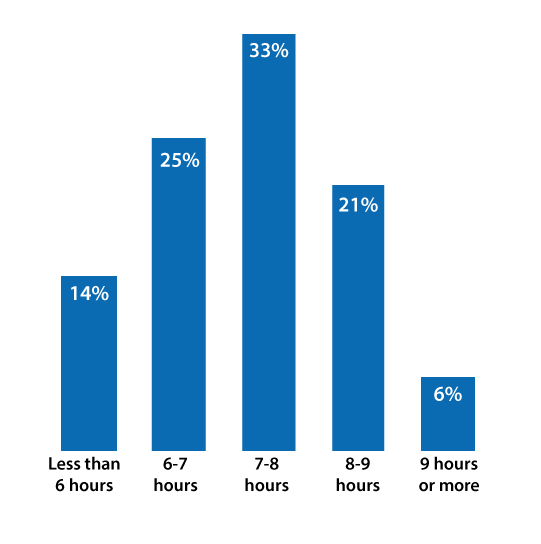
Or Try a Pictograph
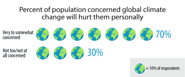
Another approach to comparing values is to use a pictogram or pictograph, in which repeated icons represent quantities. A key or legend shows how many items each icon represents. Pictographs can make quantities more concrete and visually distinctive, but they may take longer to interpret than a bar chart. To make comparisons easier, include the numeric value at the beginning or end of each row.
Pictographs are easiest to interpret when each icon represents a simple unit, and you can avoid fractions of icons.
Are you pointing out specific values?
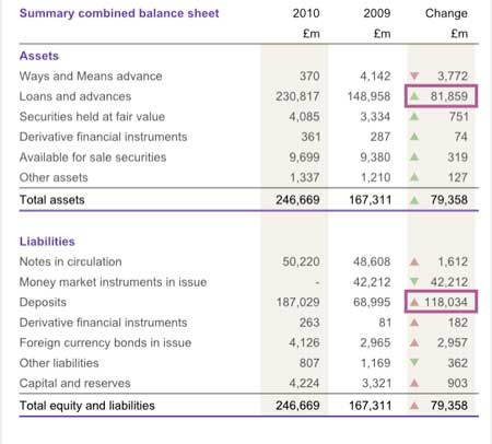
Use a table when learners need to find specific values, compare data points, or scan information across categories. Graphs are better for showing patterns, trends, and overall differences, while tables are better for precise lookup. You can also use emphasis, such as bold type, highlights, outlines, or shading, to draw attention to an important value without obscuring the rest of the data.
Tables need clear headers and proper structure so screen readers can identify the relationship between each data cell and its row or column heading. See Creating Accessible Tables for web pages. Also, see PowerPoint Accessibility to see how to make data tables accessible in PowerPoint.
There are an infinite number of ways to make concepts and data visually pleasing and easier to understand. These are just some of the ways to approach this challenging task.
Reference:
Cleveland, W. S., & McGill, R. (1984). Graphical perception: Theory, experimentation, and application to the development of graphical methods. Journal of the American Statistical Association, 79(387), 531–554. https://doi.org/10.1080/01621459.1984.10478080
[Disclaimer: The content in this RSS feed is automatically fetched from external sources. All trademarks, images, and opinions belong to their respective owners. We are not responsible for the accuracy or reliability of third-party content.]
Source link

